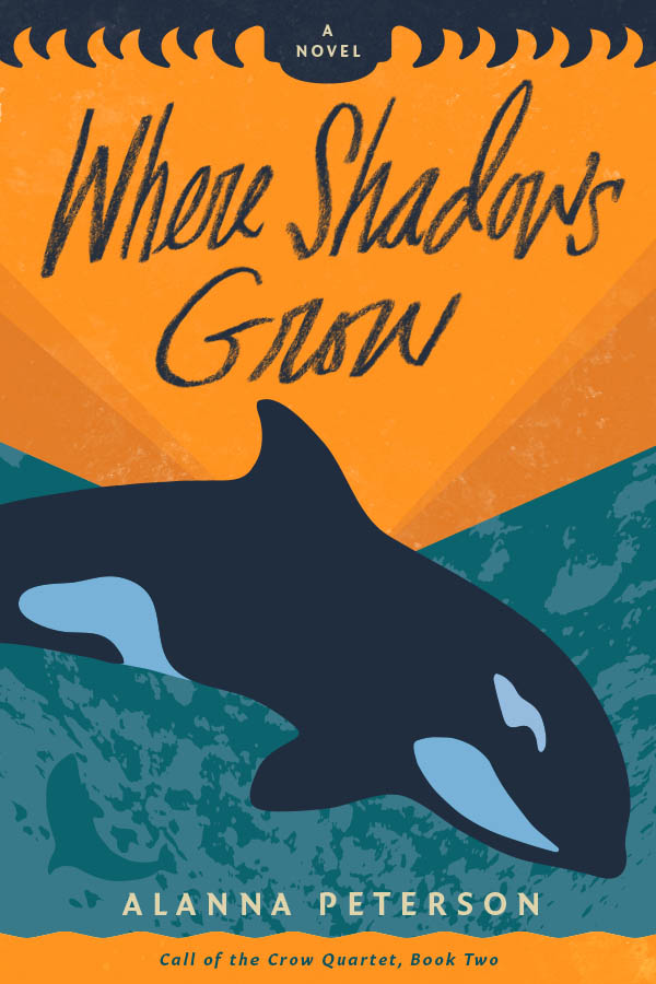
The release of Where Shadows Grow on November 17 is fast approaching, and the files went to press earlier this week! I’ve been itching to show off the cover. But before I get to that, let’s talk a little about how it came to be.
The Process
When I started working on this project with my cover designer, the inimitable Jacob Covey, I sent him a summary of the main moods, themes, settings, and symbols from the book. The document was a little rambly, and I wasn’t sure it would actually be all that helpful. Especially since this particular book has a lot going on. It’s wide-ranging in time, in space, in subject matter.
But, the cover of When We Vanished provided a good framework to work within. We had talked about continuing with the “animal silhouette” theme, and for this book (which, once upon a time, was given the working title Whisper of the Whale), there was no doubt in my mind which animal would take center stage.
So, when I opened up the initial draft I was delighted to see what he had come up with. And after a bit of back-and-forth and some minor design tweaks, he sent me this masterpiece.
The Cover
Let’s break it down a little bit and dig into what makes this cover so perfect. I could probably go on for ages, so I’ll just pick out a few highlights here.
Can I rave about the colors for a moment? They feel so vibrant and alive. For me, the orange bands at the top evoke that lovely golden light that comes in late summer and early fall, the kind that casts those nice long shadows. I really love the way this cover doesn’t contain any literal shadows – yet they exist within it, subtly, by implication. (Which, incidentally, is something I strive for in my writing: conveying something without spelling it out. It’s hard to do, so I have to applaud the cover for capturing this rather ineffable quality.)
The book also contains a recurring symbol that was beautifully, and subtly, rendered in this design. But I won’t go into that here, so that you can enjoy discovering it once you read the book. 😉
Finally, I adore the top border. I wasn’t so sure about it at first – it reminded me of teeth, when I thought I wanted something that was more obviously wave-like. But as my astute designer pointed out, this was an intentional choice, since there’s already plenty of ocean/wave imagery going on in the cover. Plus, considering the often-dark subject matter of the book, it was important to have an element that conveyed a hint of menace, a sense of peril looming on the horizon.
The more time I spent with it, the more I loved it. And it kept bringing to mind the closing lines of one of my very favorite Kaveh Akbar poems:
it’s true I suppose you grow to love the creatures you create
Kaveh Akbar, “River of Milk”
some of them come out with pupils swirling others with teeth
And that kind of sums up the way I feel about this book. It’s a strange creature, a difficult child that’s sometimes sweet and sometimes a little horrifying, a thing with sharp edges, with teeth. But I also love it beyond all reason, and I couldn’t imagine a more perfect cover for this particular novel.


Wowza! That cover is so beautiful!
Isn’t it, though?? I just love it!